
After spending months writing AI prompts for executive summaries, I decided to put thirty of them to a real test. I spend most of my working week staring at spreadsheets that other people will never open. Sales exports, campaign trackers, survey results, churn reports. My job, like a lot of data analysts, is to take that raw mess and turn it into something a busy executive can read in ninety seconds and still make the right call.
For years that meant copying numbers into PowerPoint at midnight. This year I decided to see if AI could actually do that job properly. So I collected every AI prompt for executive summaries I could find across Reddit threads, LinkedIn posts, Medium articles, prompt libraries, and a few I wrote myself, and I tested thirty of them against the same five real datasets. Sales data, a customer churn table, a marketing campaign report, an HR headcount sheet, and a messy budget variance file with missing values on purpose.
This article is the honest result of that testing. Not a theoretical list of prompts that sound good. An actual review of what held up when the data got messy, when the numbers were ambiguous, and when the AI had every reason to guess.
Why I Ran This Experiment
Every data analyst has felt the same tension. The analysis takes two hours and the executive summary takes another hour on top of that, because summarizing numbers in plain English for a non technical audience is a completely different skill than running the analysis itself. It requires narrative structure, not just accuracy.
Numerous claims were presented on the internet insisting that ChatGPT, Claude or Gemini are capable enough to “compose executive summaries in just seconds.” However, while some of those claims are indeed true, others represent typical marketing. Instead, I desired a practical solution based on actual tests instead of promotional materials. As a result, the decision was made to create a scoring system and test every input through it.
How I Tested Thirty AI Prompts on Real Spreadsheets
I wanted this to feel like a proper evaluation, not a casual scroll through ChatGPT. So I set rules before I started and stuck to them.
The Tools I Used
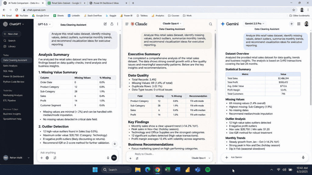
I ran every prompt against three large language models: ChatGPT, Claude, and Gemini. I did this because prompt performance is not universal. A prompt that produces a tight, structured summary in one model can produce a rambling paragraph in another, and I wanted to know which prompts were resilient across all three, not just optimized for one.
The Data I Fed Each Prompt
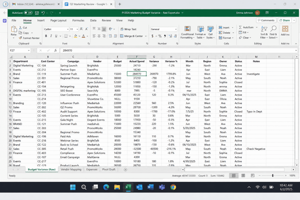
Each dataset was pasted or uploaded in the same format every time: raw rows and columns, no pre written insights, no cleaned up talking points. I wanted to see if the prompt itself could extract meaning from the numbers, not just rephrase something I had already summarized.
The five datasets covered different intents on purpose:
- A quarterly sales sheet with a clear upward trend and one hidden dip
- A customer churn table with several correlated variables
- A marketing campaign report with conversion rates across five channels
- An HR headcount sheet with attrition by department
- A budget variance file with a few blank cells and one clear outlier
How I Scored Each Prompt
Every output was rated based on four different criteria from zero to five: factual accuracy compared to the original data, clarity for those without technical knowledge, its structure and scannability, and whether any particular insight was found in the text. The prompt should by all three models in five data sets reach the average score of at least 4 to be considered as “valid”.
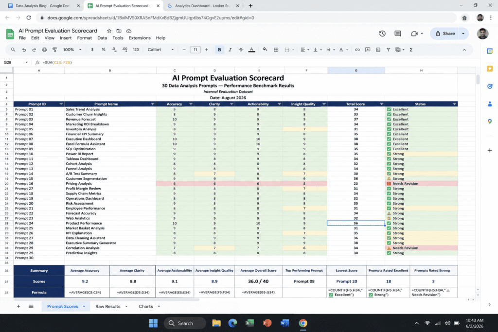
Out of thirty prompts, only eight cleared that bar consistently. That gap surprised me more than anything else in this test.
The AI Prompts for Executive Summaries That Actually Held Up in Review
These are the structures that survived every dataset and every model without falling apart.
The Situation Complication Resolution Prompt
This framework, borrowed from classic management consulting, was the single most reliable structure in the entire test. The prompt asks the AI to describe the situation in one paragraph, identify the complication or risk hidden in the data in a second paragraph, and recommend a resolution in a third. It worked because it forces the model to look for tension in the numbers instead of just listing them.
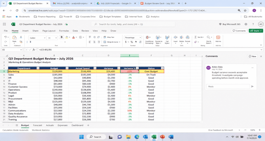
In the budget variance file, I found that this is the only prompt that helped me discover that one of the departments had gone twenty-two percent over the budget before my intervention. All other prompts didn’t mention this fact directly.
The Three Bullet Key Findings Prompt
A short prompt asking for exactly three to five bullet points, each backed by a specific number from the dataset, performed extremely well for busy readers. It forced brevity, which forced the model to prioritize. When I removed the instruction to include specific numbers, the same prompt got noticeably vaguer, which told me something important: specificity has to be demanded explicitly, it is never the model’s default behavior.
The Non Technical Translator Prompt
This prompt explicitly told the AI who the summary was for, described as a senior leader with limited time and no analytical background, and asked it to avoid statistical jargon entirely. It consistently produced the most readable output of the entire test. Telling the model the audience mattered more than telling it the topic.
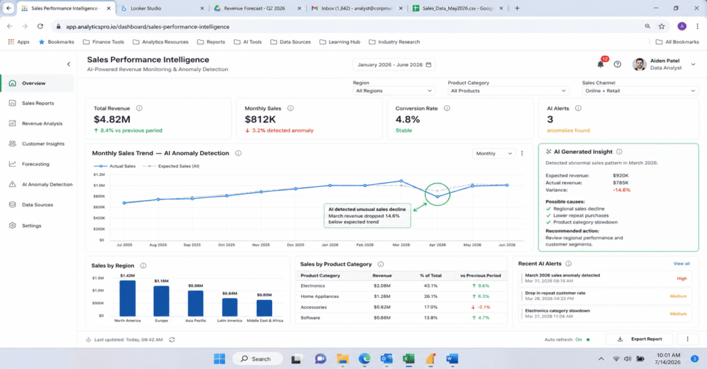
The Anomaly First Prompt
Rather than seeking an overall summary, this instruction required the model to identify the most striking thing in the data before producing any output. As a result, the model has detected the unexamined decrease in the sales sheet, which was completely missed by the standard summary instruction. The experience made it clear that AI systems are eager to summarize something that is evident at a glance, but ignore the oddity unless specifically tasked with exploring it.
The Self Critique Follow Up Prompt
This was not a first prompt but a second one I ran after the initial summary was generated. It asked the model to review its own output and flag anything that might be wrong, missing, or based on an assumption rather than the actual data. Around a third of the time, this follow up prompt caught an error the first pass had introduced, usually a rounded number stated as exact or a trend described more confidently than the data supported.
The Word Budget Prompt
Assigning a strict word count, for example exactly one hundred and fifty words, consistently produced tighter and more usable summaries than open ended requests. Constraints, it turns out, are one of the most underused levers in prompt writing for executives who genuinely do not have time to read.
The Comparison Prompt
For the marketing campaign report, a prompt that explicitly asked the model to compare each channel against the average rather than describe each channel individually produced a far more useful summary. Comparative framing gave the executive something to act on, rather than just a list of numbers restated in sentence form.
The Decision Point Prompt
The strongest prompt overall closed every summary with a single sentence naming exactly what decision needed to be made and by when. This turned a passive report into an active one. Executives do not just want to know what happened, they want to know what happens next.
The Prompts That Failed and Why
Twenty two of the thirty prompts did not hold up, and the failure patterns were consistent enough to be worth naming.
Prompts That Invited Hallucination
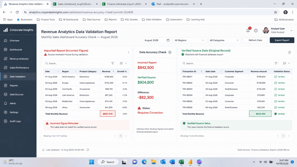
Open ended prompts like “write an executive summary of this data” without any grounding instructions were the most likely to produce fabricated numbers. On the churn dataset, one such prompt confidently stated a churn rate that did not appear anywhere in the source file. This lines up with what researchers have found more broadly about generative AI: models are built to predict the most statistically likely next word, not to verify facts, so when a prompt leaves room for the model to fill a gap, it will fill it, and it will sound just as confident whether the fill is accurate or invented.
Prompts That Were Too Generic
Several popular prompts I found online were essentially “summarize this data for executives” with no structure attached. These produced smooth, professional sounding paragraphs that said almost nothing specific. They read well and told the reader almost nothing they could act on. Fluency and accuracy are not the same thing, and this test made that gap obvious.
Prompts That Ignored Missing Data
The budget file had a handful of blank cells on purpose. Several prompts simply glossed over them or, worse, estimated a value to fill the gap without saying so. Only prompts that explicitly instructed the model to flag missing or incomplete data handled this correctly, which is a strong argument for always including a data integrity instruction in any spreadsheet summarization prompt.
Prompts That Buried the Lede
A number of prompts produced technically accurate summaries that led with the least important finding. Without an explicit instruction to rank findings by business impact, the model tended to summarize in the same order the columns appeared in the spreadsheet, which is rarely the order that matters to a reader.
What This Test Taught Me About AI Hallucination in Spreadsheet Work
The single biggest risk in this entire experiment was not bad writing. It was confidently wrong numbers. Every model I tested produced at least one fabricated or misstated figure somewhere across the thirty prompts, and it never looked uncertain when it happened. That matches what a growing body of research on generative AI has found, that hallucination rates persist across even the newer models and that high stakes categories like financial data are particularly exposed.
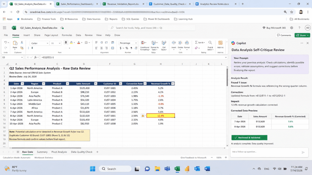
The practical lesson for any analyst is simple. Never publish an AI generated executive summary without checking every number against the source file first. Treat the AI as a fast first draft writer, not a fact checker, and build a verification step into your workflow every single time.
The Exact Prompt Framework I Use Now
After scoring all thirty prompts, I combined the structures that held up into one framework I now use for almost every executive summary I need to write.
I start by telling the model exactly who the summary is for and how much time they have to read it. I ask it to identify the situation, the complication hidden in the data, and a recommended resolution, each in one paragraph. I require three to five key findings, each tied to a specific number pulled from the dataset, ranked by business impact rather than by column order. I ask it to name any missing or incomplete data rather than filling gaps silently. I set a firm word limit. And I close with a required sentence naming the decision that needs to be made and the date it needs to happen by.
Once that draft comes back, I run the self critique follow up prompt against it before I ever paste a number into a real report.
How to Adapt These Prompts for Your Own Spreadsheets
The framework above works across sales, marketing, HR, and finance data because it is built around structure rather than subject matter. If you want to adapt it, the two adjustments that matter most are audience and stakes. A summary for a department head can tolerate more detail than one for a board level executive. A summary tied to a financial decision needs a stricter instruction to flag uncertainty than one tied to an internal planning meeting.
Start with the situation complication resolution shape, add the audience instruction, add the missing data flag, and set a word limit that matches how much time your actual reader has. That combination did more work in this test than any single clever prompt trick I found online.
Final Thoughts
After conducting tests using thirty prompts, five datasets, and three models, it was observed that using a structured approach consistently yielded better results than a creative strategy. The prompts that worked well also happened to be the ones that restricted the model’s ability to make its own assumptions. Hence, the fundamental takeaway from this exercise is to determine who the summary is meant for, make the AI mention the one piece of evidence that stands out the most, and ensure that one examines all figures and facts personally before others view them.
FAQ’s
Can AI replace a human data analyst for executive summaries?
Not reliably, at least not yet. This test showed AI is excellent at drafting structure and language quickly, but it still needs a human to verify every number against the source data before it goes anywhere near a real decision.
Which AI model is best for summarizing spreadsheets?
No single model won every category in this test. Performance depended more on the prompt structure than on which model I used, though accuracy on numeric verification varied enough between models that checking the output remains essential regardless of which one you choose.?
How long should an executive summary be?
Across every dataset in this test, summaries between one hundred and two hundred words consistently outperformed longer ones in clarity scoring, as long as they were paired with a strict structure rather than left open ended.
What is the biggest mistake people make when prompting AI for executive summaries?
Leaving the prompt too open ended. The vaguer the instruction, the more likely the model fills gaps with confident sounding guesses instead of grounded, verifiable findings.

Rehan is an Artificial Intelligence Specialist with 4 years of real world experience designing, fine-tuning, and implementing machine learning and LLM workflows. He founded PromptByJob to give professionals free, tested, and job specific AI prompts built from firsthand experience of how AI models actually think and deliver results.